Roto Toon plug-in, Roto group 2
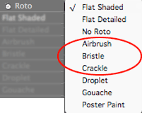
There are nine choices in the Roto pop-up, each of which applies a different rotoscoping algorithm to your footage. This page describes three of the Roto options, each of which create a stylized cartoon look. These options are called Airbrush, Bristle and Crackle.
The other stylized Roto choices are called Droplet, Gouache and Poster Paint. They are discussed on the Roto Styles 3 page. For info about the three more traditional Roto styles, go to the Roto Styles 1 page to learn about Flat Shaded, Flat Detailed and No Roto.

There are 9 choices for the Roto pop-up box. This page covers 3 of them.
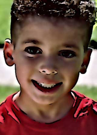
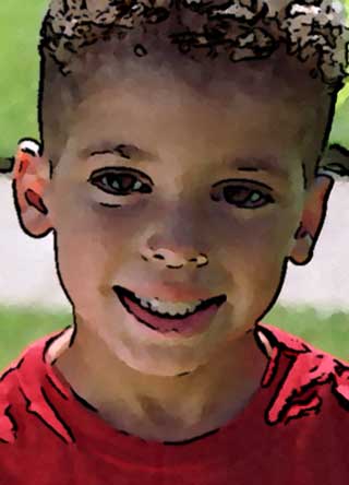
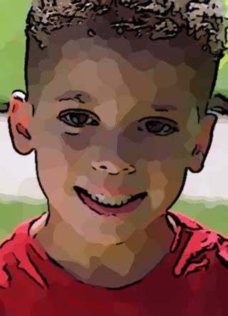
Left to right: Airbrush, Bristle and Crackle.
Roto Style> Airbrush group (NEW to v2.0)
Turned off by default. To activate, choose the Airbrush style from the Roto pop-up.
Airbrush renders an image that looks like traditional airbrush painting. The render is smooth and glossy with shiny highlights and rich darks. This effect gives the cartoon a 3D feel.

Spread
Spread increases or decreases the light and dark regions in the footage.
Default setting is 8. Value range is 1 to 50. Higher values increase the dark regions, while low settings increase the light regions. Though the slider only identifies the value as going up to 50, this setting can go up to 100 if you type in the value.
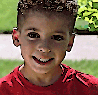
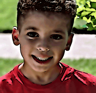
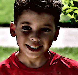
Left to right: Spread at 4, 8 (default) and 20.
Light Mix
Light Mix causes the contrast to be based one way or the other. Light Mix adjusts the relative balance of lights and darks.
Default setting is 40. Value range is 0 to 100. A low setting for Light Mix produces an image with lots of darker areas and few shiny highlights. A high setting produces an image with glows and highlights, but few darks. Light Mix set to 50 produces no effect because the dark/light balance is in the middle.
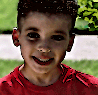
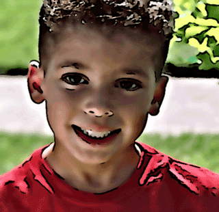
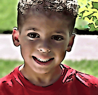
Left to right: Light Mix at 20, 50 and 70.
Spread works directly with the Light Mix control. Light Mix causes the contrast to be based one way or the other (unless it’s set to 50). Increasing the Spread with a high Light Mix will cause the highlights to blow out. If you increase Spread with a low Light Mix, then darker areas will dominate the image.
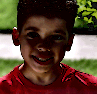
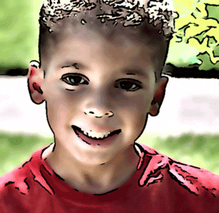
At left, Light Mix at 20, Spread at 20. At right, Light Mix 70, Spread 20.
Strength
Strength plays a similar role to the Strength control in Flat Shaded. Strength controls the definition between the dark, mid-tone and highlight segments. It’s essentially adjusting the contrast for each individual color region independently from the other color regions.
Default setting is 1.5. Value range is 0 to 5. Increasing Strength makes the image's lights lighter and darks darker. Decreasing Strength does the opposite.
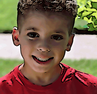

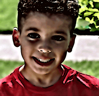
Left to right: Strength at 0.5, 1.5 (default) and 3.
Roto Style> Bristle group (NEW to v2.0)
Turned off by default. To activate, choose the Bristle style from the Roto pop-up.
The Bristle style looks as if paint has been applied at the end of a thick bristle brush, obscuring where one dab ends and next begins. This creates an effect that can vary from a pointillism style to smooth brush strokes.
All of the Bristle controls rely heavily on one another. Therefore, it’s difficult to say that Presharpen or Spread create a specific effect. The following descriptions are guidelines and their effect will change depending on the other settings.

Comparison of Bristle and Gouache
The Bristle style is related to the Gouache style but there are some basic differences. Gouache has a smoother look, while Bristle has a rougher look. Bristle and Gouache also have differences in 'paint dab' size, as the Gouache dabs are generally bigger. The Bristle paint looks more locally textured, like applying paint using the side of a sable brush vs. the end of a bristle brush. Both can produce effects that look cool and artistic. Their settings (Presharpen, Spread and Postsharpen) behave in a similar fashion.
Presharpen
Presharpen sharpens the underlying image before the Bristle effect is applied. This control tends to set the look of the brush strokes. It creates a light segmented effect, like small blended dabs of paint.
Default setting is 5. Value range is 0 to 10. Lower values make the Bristle effect look softer. Higher values result in a more well-defined, harder-edged brush stroke.


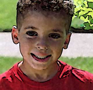
Left to right: Presharpen at 2, 5 (default) and 9. Higher values have more well-defined paint dabs.
Spread
Sets the size of the brush strokes or 'paint dabs'. Default setting is 3. Value range is 1 to 25. Low to medium values usually produce the best results.
Lower values result in the pointillism effect. Higher values get into a more traditional painterly style. Depending on the Presharpen settings, high Spread values can create blurred, mushed-up colors which look pretty interesting with outlines overlaid.


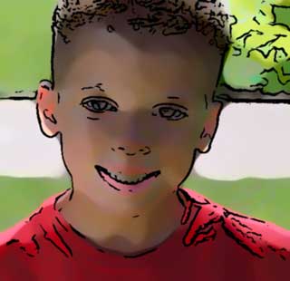
Left to right: Spread at 2, 10 and 20. Higher values look less paint-like.
Spread works directly with Presharpen. At low Spread values, a high Presharpen creates a pointillism-style effect. At high Spread values, a high Presharpen creates a textured brushstroke of sorts.


At left, Presharpen at 2, Spread at 5. In middle, Presharpen at 9, Spread at 5. At right, Presharpen at 9, Spread at 15.
Postsharpen
Postsharpen applies sharpening to the image after the Bristle effect is applied. This creates contrast between the colors within the brush strokes, and definition between the dark, midtone and highlight segments. Postsharpen can make the brush strokes look more textured and 3-dimensional.
Default setting is 0.5. Value range is 0 to 4. Higher values make the dabs appear rougher and more prominent.


Left to right: Postsharpen at 0.5 (default), 2 and 4. Higher values make the paint dabs more prominent.
Quality pop-up
Bristle can be a very slow effect to render. Quality determines the quality of the Bristle effect, or basically the amount of detail that is affected by any setting. The pop-up menu has two options, a Fast Quality and High Quality. Set it to Fast for better interaction while tweaking your settings. Always set it to High before rendering the image as a final output.
Roto Style> Crackle group (NEW to v2.0)
Turned off by default. To activate, choose the Crackle style from the Roto Type pop-up.
Crackle produces a sort of cracked-paint look. This is similar to a Crystallize filter (like the one in Adobe Photoshop) that has its cracked regions only within similarly-colored areas. This retains the overall image structure and gives a more sophisticated result. The image doesn’t entirely get reduced to crackled ‘cells’. Within the cells, especially for larger cell sizes, some of the detail from the original image will remain. Crackle tries to reduce each cell to a homogenous color tone, but in regions where there’s a lot of contrasting detail, if you have a large cell size that homogenization is not really possible.
Crackle is an unusual Roto style because it also works in conjunction with the Marker Outlines group. Together, Crackle and Marker produce a beautiful stained glass look. (read more)

Flatness
Flatness sets how much coloration will be in the image. It produces larger or smaller cells of similar or single colors. This spreads the color field bands out across the footage. Flatness makes highlights and shadows stand out a lot more, but also reduces the depth of the frame.
Default setting is 10. Value range is 0 to 30. The higher the Flatness, the less gradation of color and the larger the regions of color will be. This means the ‘cells’ (each region that looks like a chunk of cracked paint) get larger and you’ll see less detail in the image. Lower Flatness values mean smaller cells and more detail.


Left to right: Flatness at 2, 10 (default) and 25. Higher values mean larger color cells and less detail.
Simplicity
Simplicity controls the amount of color detail that is retained in the image. This controls how 'simple' the cell breakdown is and how much less detail will exist between the color cells.
Default setting is 10. Value range is 0 to 25. Higher Simplicity values give less color detail which means larger cells or regions of color. Lower Simplicity gives more color detail and smaller color cells.


Left to right: Simplicity at 2, 10 (default) and 20. At higher values, the cartoon is more simplified with larger cells.
Separation
Separation is the most direct way of changing the cell size. Default setting is 5. Value range is 1 to 30. Lower values make smaller cells, higher values make larger cells. Works in tandem with Flatness and Simplicity to control the cell size and detail.


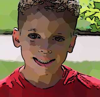
Left to right: Separation at 2, 8 and 15. Higher values make larger cells.
Strength
Strength controls the definition between the dark, mid-tone and highlight cells. This is a setting that you should change very incrementally. The functional range is really from about 0.5 to 1.5. Above that it starts producing wild artifacts which are usually undesirable.
Default setting is 1. Value range is 0 to 5. The higher this value is, the more distinct the darks and lights will be from each other. At lower values, the darks and lights becomes more blended together, and the image gets brighter overall and loses more contrast.


Left to right: Strength at 0.5, 1 (default) and 1.5. At higher values, the cartoon is more simplified with larger cells.
Use Crackle with Marker Outlines
Crackle is a stained glass look that is designed to work with the Marker Outlines group.
Without Marker Outlines, Crackle produces a sort of cracked paint look. However, when Crackle is used with Marker Outlines, an excellent Stained Glass look is achieved. Using regular Comic or Soft Outlines for this Stained Glass effect doesn’t work very well. The cracked cells don’t usually correspond to the same areas that normal outlines do, so the resulting combination can look a little off.
The Crackle controls of Flatness, Simplicity and Separation all interact together to create the cracked cells. These are the same controls as in Marker Outlines, which has a Reuse Crackle checkbox that allows you to just use the Crackle controls.
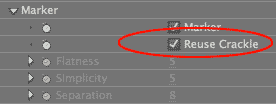
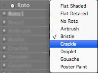

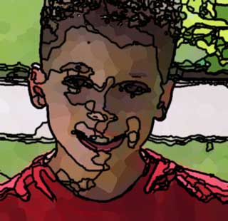
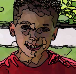
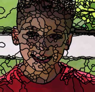
At left, Reuse Crackle off. In middle, Reuse Crackle on.
At right, Reuse Crackle on. Crackle set to Flatness 5, Simplicity 8, Separation 6, Strength 1. Marker Outlines set to Thickness 2, Minimum Difference 4.