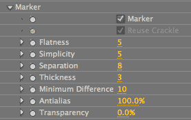
Roto Toon plug-in, Marker Outlines group
Marker Outlines produces two main effects. By itself, Marker can produce an ‘etch-a-sketch’ sort of look with black squiggly lines following the edges of the Roto Toon color fields. In combination with the Crackle Style, Marker produces a stained glass effect.

Marker checkbox
Turned off by default. Turning this option on will activate the Marker controls. This produces an effect of black squiggly lines. Turning off the Marker checkbox will give you standard Roto Toon color fields. The color of the outlines is set by the Outline Color control and can be changed to any color from its default of black.


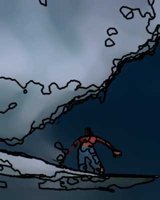
At left, original footage from ArtBeats Stock, www.artbeats.com. In middle, Marker checkbox off. At right, Marker checkbox on.
Reuse Crackle checkbox
Turned off by default. Reuse Crackle is activated by choosing the Crackle style from the Roto pop-up menu.
This option tells Crackle to be factored in when calculating Marker outlines. This causes the Marker lines to exactly match the Crackle edges, which produces a stained glass look. Selecting Reuse Crackle also turns off the Marker controls of Flatness, Simplicity and Separation and lets you use the corresponding controls in the Crackle group.
If this option is turned off, then the Marker outlines will not necessarily match up with the color fields generated by Roto Toon.
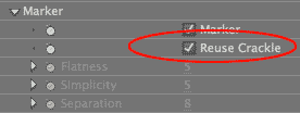
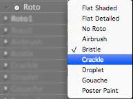

Stained Glass Look with Crackle Style
The Stained Glass look is a combo of the Crackle style and Marker Outlines. To do this, Marker creates the outlines that separate the glass pieces to create ‘cells’ of color. Crackle creates the color cells by detecting the Roto Toon color field edges.
Adding Marker outlines to the Crackle edges makes for a pretty realistic stained glass effect. You can turn the Marker Outlines off and just use Crackle by itself, but adding the lines really helps to make the look believable.
NOTE: Once you have made Reuse Crackle active, you can then turn off the Reuse Crackle checkbox, but still have the Crackle option active in the Roto style pop-up. This will keep the Crackle color cells showing in your footage, but the Marker lines will not match up. This also means that the Flatness, Simplicity and Separation controls will be active.

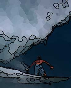
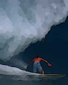

Far left: Marker on, Reuse Crackle off.
Middle left: Marker on, Reuse Crackle on, Crackle style on. With Reuse Crackle, the Marker lines match up to the Crackle colored cells.
Middle right: Marker on, Reuse Crackle off, Crackle style on.
Far right: Marker on, Reuse Crackle off, Crackle style off. The Crackle style will still apply even if Reuse Crackle is inactive.
Flatness
Active when Reuse Crackle is off. Flatness sets how much edges there will be in the image. It produce larger or smaller regions of similar or single colors.
Default setting is 5. Value range is 0 to 30. The higher the Flatness, the fewer gradations that you’ll see and the larger the regions of outlines will be. This means the ‘cells’ (each region that is surrounded by an outline) get larger. Lower Flatness values will produce more cells and more detail.
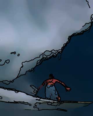
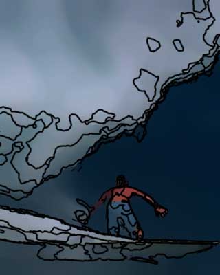

Left to right: Flatness of 1, 10 and 25. Reuse Crackle is off. Higher values mean larger regions of outlines (or 'cells').
Simplicity
Active when Reuse Crackle is off. Simplicity controls the amount of edge detail in the image. The higher the value, the less detail you’ll be able to see.
Default setting is 5. Value range is 0 to 25. Lower Simplicity gives more edge detail and smaller outline fields. The higher the Simplicity, the more 'simple' the outline fields are. This means that less detail will be shown, which results in larger cells or regions.
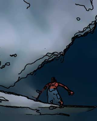
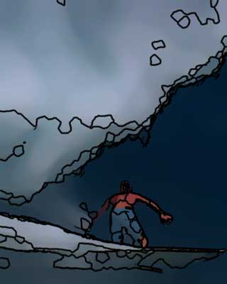
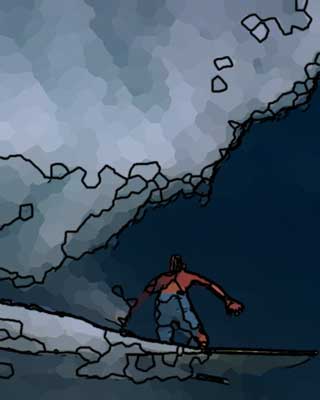
Left to right: Simplicity at 1, 10 and 25. Higher values mean simpler, wider outline fields.
Simplicity works in conjunction with Flatness. When Simplicity and Flatness are high, there is less outline detail (Simplicity) and larger outline fields (Flatness). When Simplicity and Flatness are lower, there are smaller, more detailed fields of outlines. When Simplicity is lower than Flatness, then more detail gets etched into the broader outline field. When Flatness is lower than Simplicity, then the outline fields are smaller and less detailed.
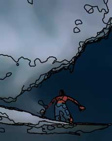
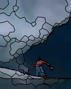
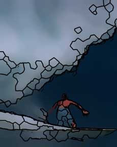
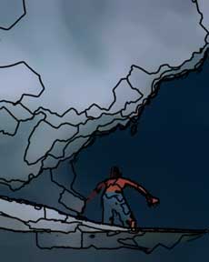
At left: Flatness at 5 (default), Simplicity at 5 (default). Middle left: Flatness at 20, Simplicity at 20.
Middle right: Flatness at 10, Simplicity at 20. At right: Flatness at 20, Simplicity at 10.
Separation
Active when Reuse Crackle is off. This is the most direct way of changing the Marker cell size.
Default setting is 8. Value range is 1 to 30. Lower values cause smaller cells, higher values cause larger cells. Separation works in tandem with Flatness and Simplicity to control the cell size.
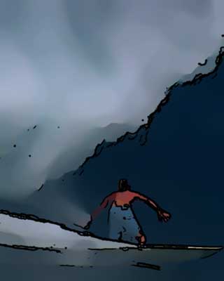
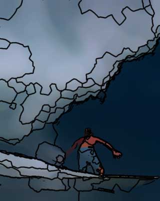
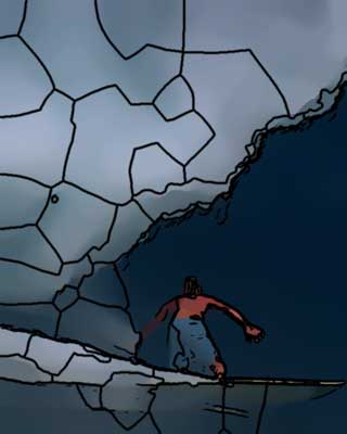
Left to right: Separation 2, 15 and 30.
Thickness
This sets the thickness of the Marker outlines. Default setting is 3. Value range is 1 to 30. Higher values mean thick lines. Depending upon your image, higher values will generate such thick outlines that the underlying image will be covered.
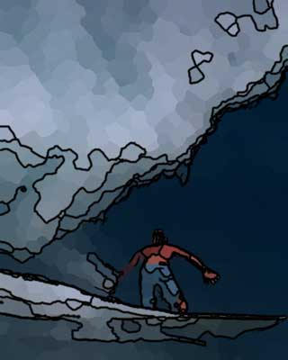
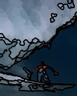
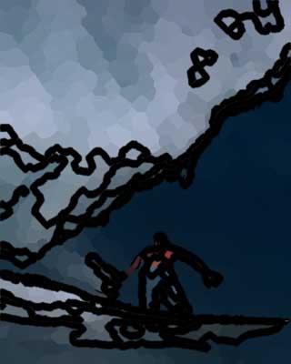
Left to right: Thickness 2, 5 and 8. Reuse Crackle is on.
Minimum Difference
This is really the most interesting control for Marker Outlines. This will cause the cells to be densely arrayed creating that Stained Glass look. Use Flatness and Simplicity to get larger cells.
Default setting is 10. Value range is 1 to 20. To get very distinct cells, set this to 1 or 2. Higher values result in outlines going off in random directions, producing an etch-a-sketch look. Very much like not-quite-random, modern-art scribblings. A large Minimum Difference can create a chaotic line drawing. A small Minimum Difference is best used for creating a stained glass look with Crackle.
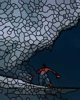
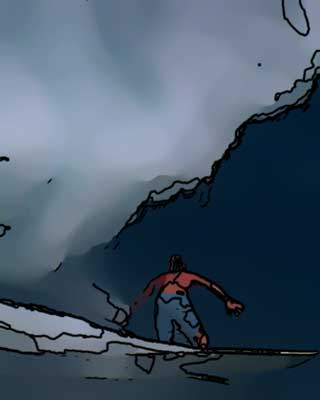
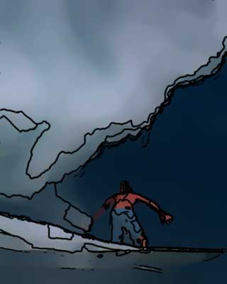
At left: Minimum at 2, Flatness at 5, Simplicity at 5. In middle: Minimum 15, Flatness 5, Simplicity 5. At right: Minimum 15, Flatness 20, Simplicity 10.
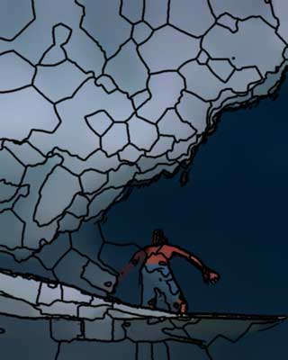
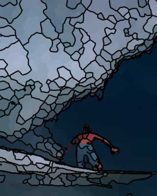
At left, Reuse Crackle off. At right, Reuse Crackle on. For both, Minimum 5, Flatness 20, Simplicity 10.
Antialias
Antialias is a percentage slider for the final output that helps to tone down any jagged edges. Default value is 50%. Value range is 0 to 100.
An Antialias of 0% is very slightly faster, but otherwise the render speed is the same as at higher values. Sometimes Antialias of 100% can look a bit blurry. If this is the case, just lower the setting a bit.
Transparency
This sets the opacity level of the Marker effect. The default is 0%, which is fully transparent. Value range is from 0 to 100. The higher the value, the more transparent the Marker outlines are. The lower the value, the more opaque they are.

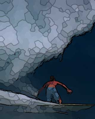
Left to right: Transparency at 30 and 70.