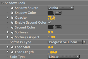
RG Shadow plug-in: Shadow Look group
It's the cosmetic facelift group! These controls govern the shadow's appearance. Choices include how the shadow is generated; details of its appearance, such as color and blur; and the stylization of how the shadow fades out. While the Reflection plug-in does a full RGB mapping, the Shadow plug-in does its grayscale mapping with a single color.
While most of the control sections in the Shadow and Reflection plug-ins are almost identical, this Shadow Look group is different. This is because while the Shadow plug-in does its grayscale mapping with a single color, the Reflection plug-in does a full RGB mapping. Therefore, the Shadow Look section has controls for Source, Color and Opacity that are missing from Reflection's Reflect Style group.

Shadow Source pop-up
This control isn't simply cosmetic. Shadow Source defines the different channels of information from which the shadow can be generated.

Alpha: By default, Shadow Source is set to Alpha and this is the option that you will typically use. This means the shadow is generated off the alpha channel of the source layer. Generally, you will just have a black and white alpha image. However, you can include grayish values. The more grayscale values in your alpha channel, the more intermediary values will be in your shadow. This is because white shows the glow, black hides the glow, and gray values partially show the glow.
Let's look at a few examples of the Alpha option to see what we mean.
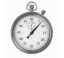
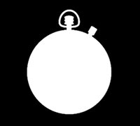
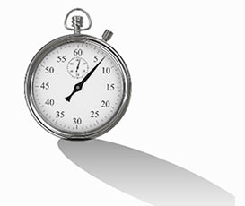
The stopwatch bitmap image was imported with an alpha that we created in Photoshop.

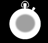
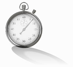
If the alpha has gray values in it, the shadow will reflect those values.



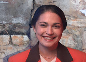
The Artbeats.com footage of the woman did not have an alpha channel. We generated our own alpha with After Effects' Keying> Keylight filter.

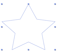

The vector star shape, which is an object generated by After Effects, has a built-in alpha.
Red, Green, Blue: While you will typically use the Alpha option as the Shadow Source, you can alternately choose any of the RGB channels as the shadow's generation source. The options of Red, Green and Blue each create a shadow using the values from the Red, Green or Blue channel of the source image. A histogram is created for the brightness distribution of any of these colors individually, and the shadow is mapped to those values.
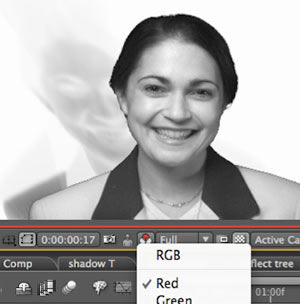


Left to right: The Red channel's grayscale information, the Red source option, the Green source option.
Lightness, Luminance: For the Shadow Source, you can also use the lightness or luminance information as the shadow's generation source. The Lightness and Luminance options each create a channel for the luminance or lightness values in the source image. These options look somewhat similar but can create slightly different results. Luminance is a histogram based on the human perception of the brightness of RGB values, which is most sensitive to green and least sensitive to blue. Lightness is based on a histogram of the true brightness values of all three color channels. Depending upon your image, the brightest values could get clipped in either option, which changes the overall distribution of the shadow values.


Left to right: Lightness and Luminance options. Interestingly, these shadows look similar the reflections generated by our Reflection plug-in! Kind of a reflection with inverted darks and lights.
Shadow Color
Shadow Color does exactly what its Public Relations department claims: It defines the color of the shadow. Typically you will keep your shadow color neutral, using the default of black or perhaps a shade of gray. If you want to have red or purple shadows, however, this is the setting to visit. In fact, being able to move your shadow away from black/gray and into a dark color from color palette of your project can be a nice design enhancement.
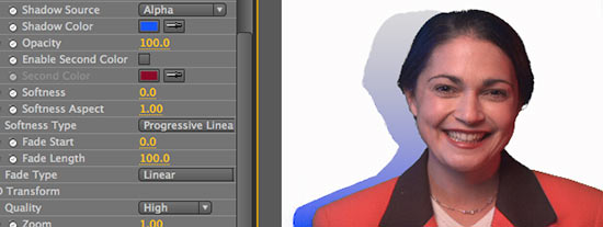

Left to right: Shadow Color is blue. The blue shadow looks pleasing against the rock wall behind it.
What's happening in the background is a color (blue, in our example) is being mapped to the grayscale values of the alpha that defines the shadow. An interesting visual aberration occurs as the shadow fades out. Shadow Color becomes more transparent as it fades out, which means its shading gets lighter. The Shadow Color will eventually fade into a neutral-looking value, appearing grayish or blue-gray, even though it's really a 10% blue or red. This actually a good function of the Shadow Color since it maintains some realism for the shadow even if you are fading out a yellow shadow.
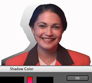
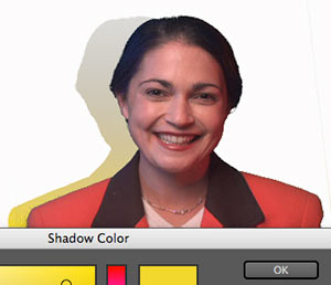
The black and yellow Shadow Color choices fade into the same color tone at the transparent end point of the shadow.
Opacity
You can also set the opacity of the shadow. The Opacity setting lets you control how distinct the shadow appears in contrast to its source object, and how it works compositionally with the surrounding imagery. This control is equivalent to Blend> Reflection Opacity in the Reflection plug-in.



At left, Opacity is 40. Middle, Opacity at 100 (the default). At right, an Opacity of 70% blends naturally into the rock background.
Enable Second Color checkbox
You can add a second color to the shadow. Enable Second Color tells the plug-in to map two colors to the grayscale values of the alpha to its luminance values. The lighter (or more transparent) shadow parts take on the Shadow Color. The lighter shadow parts take on the Second Color.
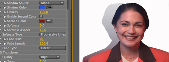
The red Second Color takes on the darkest shadow tones, while the blue Shadow Color takes on the mid- to low-range tones.
Second Color
Grayed out by default, this control is activated by the Enable Second Color checkbox. It adds a second color to the shadow for a blended, gray-mapped palette that defines the shadow's color.
For example, if the Shadow Color is blue and the Second Color is red, the shadow will be red at its baseline, where the shadow is darkest in contact with the source image. The shadow will be blue around the midtones. The shadow blurs the two Colors as it moves away from the baseline, blending between the Shadow Color and Second Color to make a soft transition of color between.
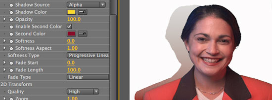
The red Second Color looks red at the shadow's dark baseline. The yellow Shadow Color blends with red to create an orange around the mid-tones. The yellow fades to a neutral gray color in its lightest tones.
Softness
Controls the blur value through the shadow. This control affects the entire shadow, though you mostly notice it around the shadow edges. It is not constrained by grayscale value or other characteristics. The default is 0, or no blur. Setting the Softness between 10-30 contributes to the realism of the shadow blending into the background.

At left, Softness at 30, Opacity at 70. At right, Softness at 0, Opacity at 70. The left side shadow blends better at a higher Softness.
Softness Aspect
A subtle control for how the shadow looks. It controls whether the shadow is softer in the horizontal or vertical direction by setting the softness of the shadow's edge in terms of its height vs width. The default value is 1, which means the shadow edge is blurred in both directions and its height/width aspect ratio is 1:1. The greater this value is above 1, the more stretched the Softness becomes vertically. If the value is less than 1, then the Softness becomes stretched horizontally.
In order for Softness Aspect to work, the Softness has to be turned up high enough to generate softness in the shadow. At the Softness default of 0, for instance, Softness Aspect will have no effect on the shadow.
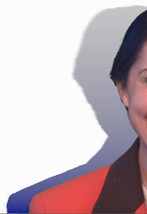
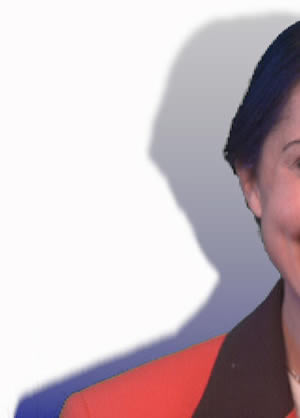
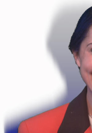
Left to right: Softness Aspect of 0, 1, and 5. Values above 1 stretch the blur vertically. A value of 0 turns off the blur. Softness is set to 20 for all images.
Softness Type pop-up
Softness Type has a significant impact on how the shadow looks. This control determines the smoothness and fadeout of the shadow. There are four algorithms to choose from: Simple, Mip Map, Progressive Linear (the default) and Progressive Square.
Related controls are Fade Length, Fade Start, Softness, and Fade Type. Each of these has a stylistic effect on the Softness Type.

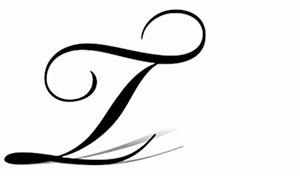
Simple: Creates a simple triangular blur across the whole shadow. Areas where there is a reasonably high opacity get blurred out and there isn't a progressive falloff of shadow. In images with a variation of line weight, like our 'T' below, the thicker parts stay more noticeable while the thin parts are more blurred out. Unlike the two Progressive options, the style of the blur does not depend on the shadow's direction.
When choosing the Simple option, if you have both Shadow Color and Second Color active, you may find that the first color disappears. Most likely this is because the Softness value is set high. The Softness value affects the shadow greatly because it overrides the Fade Start value, and this may stylize the effects of Simple.
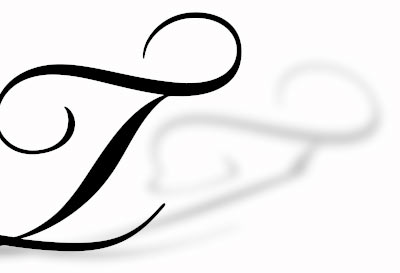

Softness Type> Simple applies an evenly spread softness to the shadow. Softness at 20.
Mip Map: Uses a series of pre-calculated, optimized bitmap images of varying sizes to do its interpolation. Huh? Basically, Mip Map builds the shadow blur by putting together small and large pre-made graphics.
These building blocks causes the shadow to look more blurry as it moves from the baseline. There is a finer blend and softness as the shadow gets farther from the source object. The fadeout is more progressive and more pronounced because the blur gets more defined as it spreads out. Mip Map treats its shadow like a 3D rendered shadow, as if the further away from the light source, the more the polygon spreads into a greater softness.
For you enthusiasts out there, Mip Map is the algorithm used for Real Shadows 1.0 in Red Giant's Image Lounge product.
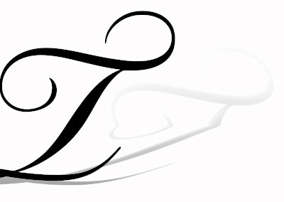

Softness Type> Mip Map creates an increasingly soft falloff for the shadow. Softness at 20.
Progressive Linear: The default Softness Type setting, which creates a blur based on the direction of the shadow. There is very little softness around the baseline of the shadow. The further the shadow is from the baseline, the more softness there is in the shadow. It blurs out pretty heavily towards the end of the fadeout. Progressive Linear does a scan line-based blur, which means the falloff has a linear ramp, like Fade Type> Linear.
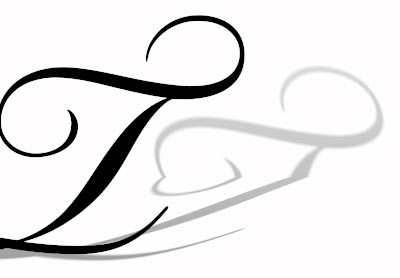

In Softness Type> Progressive Linear, the softness of the shadow increases as it moves in a linear direction away from the baseline. Softness at 20.
Progressive Square: Like Progressive Linear, the Progressive Square algorithm bases its blur on the direction of the shadow. However, Square's falloff is a square function, not linear, so the blur falls off slower and doubles in its amount of softness.
You won't see the same amount of stylistic difference between Square and Linear as with the other two algorithms. Square will look a bit more defined than Linear because the shadow blurring begins earlier and takes longer. Progressive Square uses a curve to decide where and how much blur to give to the shadow, similar to the behavior of Fade Type> Inverse Square.
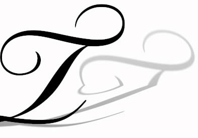

Softness Type> Progressive Square is like Progressive Linear, except the shadow's softness builds more slowly and over a longer length of the polygon. Softness at 20.
Fade Start
Determines where the shadow begins to fade. It is measured as a percentage of the height of the source image that is being transformed. Therefore, a Fade Start of 50 is 50% of the image height. This control is affected by Opacity, Softness Type and especially Fade Length (see below).
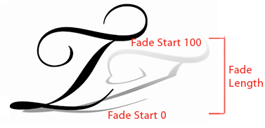
Diagram of Fade Start values from 0-100.
The Fade Start default is 0, which means the fade starts at the baseline of the shadow. At Fade Start of 0, the shadow begins to fade from the baseline, and increasingly fades towards the end of the shadow. At low settings for Fade Start, like 30, you get a more defined fade and a softer overall shadow. As the values get higher, the starting point moves up the shadow's length, therefore shortening the amount of shadow that can be faded.
The maximum value for Fade Start is 100. If you set Fade Start to 100, the fade will begin at the very end of the shadow, which makes a more defined shadow and basically means you won't see a fade at all.
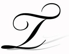
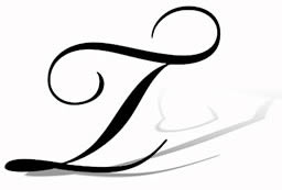
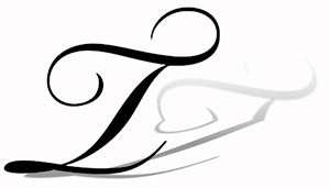
Left to right: Fade Start 0, 10 and 20. Fade Length at 30.
Fade Length
Controls how long the fade takes to happen. It does this by deciding how much of the shadow height should be used for the fade. As with Fade Start, this amount is measured as a percentage of the height of the source image that is being transformed. The default is 100%. NOTE: Fade Length is often easier to see with the two Progressive options for Softness Type.
If you set Fade Length to 0, you get no fadeout in the shadow. The shadow is going to be pronounced from its baseline all the way to the other end.
A low percentage value means the fade happens quickly. This simulates a situation as if the light was sitting directly above the source object. The fade starts close to the baseline of the shadow and affects the shadow immediately, which means the shadow will appear to be very short. A value of 10, for instance, means there will be only 10 or 12 pixels of shadow.

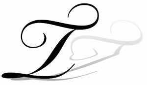
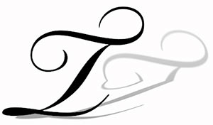
Left to right: Fade Length 30, 60, 100. Fade Start at 0.
A high value means the fadeout takes awhile and the falloff is more defined. The shadow becomes more elongated as if the light is above but further away from the source object. If you set Fade Length to 70 or 100, the fadeout goes all the way to the end of the shadow. In fact, as we crank up the value, if the shadow isn't really long, then we wind up going past where the fade is going to have any effect, so the difference between a setting of 100 and 200 may not have any visual difference.
Using Fade Start & Fade Length
The setting for Fade Start will drastically affect how Fade Length behaves. Also, the length of the shadow itself greatly affects both controls.
For Fade Length to really work, you need to have Fade Start set to a low value. For instance, if Fade Start is set to 100, then you won't see Fade Length have any effect (no matter what its setting) because the fade starts at the end of the shadow instead of at its baseline. If Fade Start is 100 and Fade Length is 0, you'll still get a complete shadow because it has nothing to fade out on.
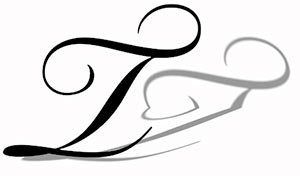

At left, Start 100, Length 10. In middle, Start 0, Length 10. At right, Start 0, Length 100. Length has little impact when Start is set high. When Start is lower, Length is able to calculate its fade.
Fade Type pop-up
Controls the stylization of the fadeout, or how quickly the shadow is going to fade from its baseline. This setting really lets you refine what the shadow details look like. The three options are Linear (the default), Square and Inverse Square.
Fade Type is related to Fade Start and Fade Length. The effect of Fade Type will depend upon how much length there is in the fade of the shadow. If Fade Length is a high value, then Fade Type has a more visible effect.




Left to right: Square, Linear, Inverse Square. Fade Start at 5, Fade Length at 60.