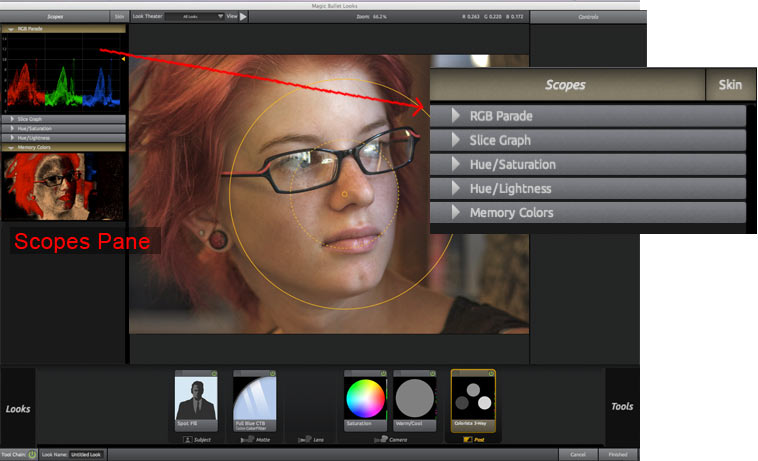
Scope Pane
There are six scopes: RGB Parade, Slice Graph, Hue/Saturation, Hue/Lightness, Memory Colors, and Skin. The six scopes are turned off by default and each is activated by clicking its Scope name.
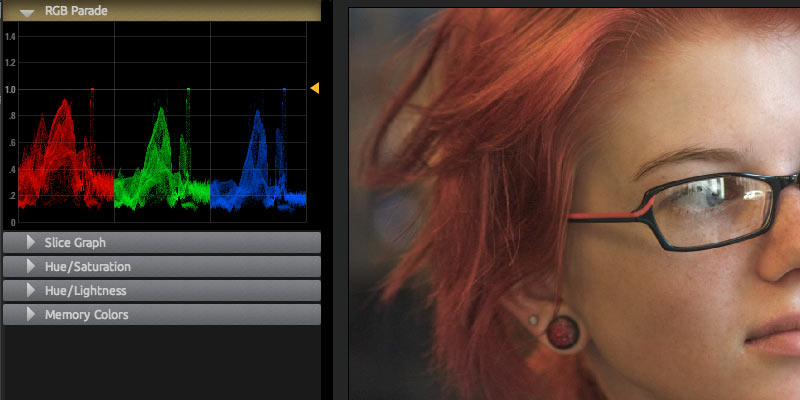
RGB Parade Scope
Displays a graph showing the amount of Red, Green, and Blue in an image. This scope is an incredible wealth of information about overbrightness.
In the RGB Parade, the brightness of an average of a number of columns is shown as values from top to bottom in the graph. The graph shows a range of greater than 0-1.0 in floating point units. The range scales from 0.0 to 100.0, showing up to 100 stops of brightness. You can click and drag the yellow triangle (at right) to adjust the vertical scale of the graph to display overbright information.
Any overbright information is shown above the 1.0 line and its yellow arrow. These values can be processed in a non-linear format like Cineon for film output, but will cause solid white areas in digital formats. The Auto Shoulder tool in the Post tools section can be used to keep all colors in the 0-1.0 range.
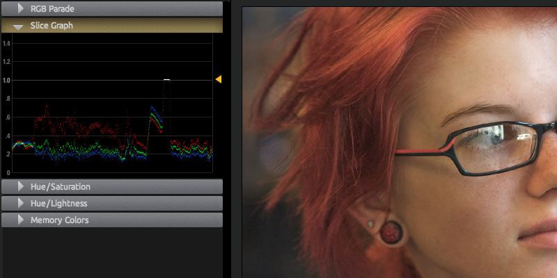
Slice Graph Scope
Displays Red, Green and Blue values of a single row of pixels. This scope can be useful for identifying specific overbright ranges, or color values for flesh tones.
That single pixel row is designated by a yellow arrow. Click and drag the yellow triangle to change the row readout. Move the yellow triangle in the graph to adjust the vertical scale of the graph.
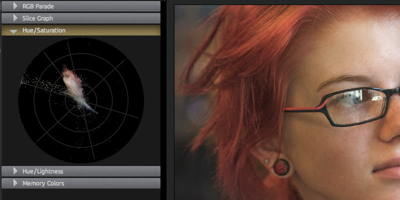
Hue/Saturation Scope
This scope is borrowed from the powerful keyer in Magic Bullet Colorista II. It arranges the hues in a ring that matches the orientation of the color controls. More saturated colors live farther out on the ring. As colors become desaturated, they move toward the center of the ring.
This scope can be used to check skin tones. The line that points northwest is marks the ideal hue for human skin of any race. You can use a tool like the Color Filter tool to push the colors around visually.
You can also use the H/S scope to check for color harmonies in your image. Complimentary colors are found on opposite sides of the circle. If you have clumps of color gathered opposite each other, there's a good chance you have a pleasing palette.
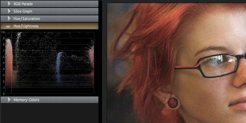
Hue/Lightness Scope
This scope is also borrowed from our Colorista II keyer. This scope is similar to the Hue/Saturation scope in that it lays out hues in a rainbow, but in this case it is measuring hue against luminance. Use this scope to check how bright your skin tones are or how close you are to blowing out your blue sky.
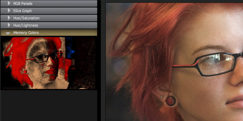
Memory Colors Scope
An image will appear well-balanced when the colors of certain objects appear to match our memory of what they should be. Examples include blue skies, green foliage and the warm tone of human skin of any ethnicity. These colors are sometimes called 'memory colors' and it can be challenging to know when your colors match these targets.
The Memory Colors Scope makes it easy to tune your corrections to bring colors toward their pure tones. The scope shows a miniature copy of your image, but only displays the memory colors of red, green, blue and flesh tones. If your colors are missing these targets, the image in the scope will appear black. Wherever your image is hitting the memory color targets, the scope will light up with the appropriate colors.
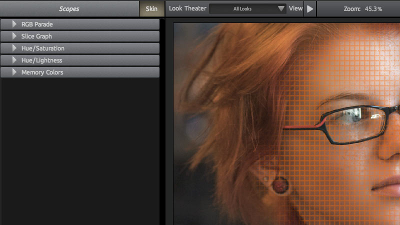
Skin Scope
Identifies skin tones by placing an orange grid over those areas. Wherever the orange lines are drawn, a true skin tone is identified underneath. As you edit color values with the PhotoLooks tools, the Overlay grid will shrink or grow to cover areas that should be flesh tones.
Skin Scope is a quick way to check if your skin tones are are identified properly and will look correct. This gives you a good guide to color correcting for skin tones specifically, which is a difficult task. This grid helps you set up skin colors that will align properly to correct skin tones on a vectorscope (which is a device used to measure color in a video signal).
Use Skin Scope when you want to do some fine tuning for skin correction. For instance, activate Skin scope when working with the Cosmo tool or Pop tool so you can check skin tones as you work. If the orange lines increase, that means you have added true skin tone. If the lines decrease, you have removed true skin tone.