
Quick Start for Roto Toon plug-in in After Effects
We'll start with the Roto Toon plug-in, which is the meat and potatoes of ToonIt. Roto Toon controls fall into a few categories. There are rotoscoping effects that generate color fields and blurs. There are edge detection controls to create the cartoon outlines that overlay these color fields. There are also more stylized versions of these colors and outlines. In this Quickstart Guide, we are going to discuss how to set up a 'traditional' cartoon look.
For our example, we have imported an Artbeats Stock movie of two boys. The human face is typically what is most difficult to ‘toon’ because people have so many expectations about what the features and expressions should look like. Preserving those details is what makes Red Giant Toonit so amazing, so let’s get started looking at them.
It's pretty darn easy, so let's get started! We are working inside of After Effects but the methods and results are the same for other host applications.
Step 1: Set up the composition
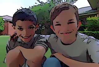
Let’s make a composition by dragging our imported footage over the New Comp button in the Project Window. The composition takes on the physical size and length of the Artbeats movie. Now double-click to open the composition, then select the footage in the Preview Window. Apply Roto Toon from the Effects> Red Giant Toonit menu. You immediately get a cartoon look. Let's make this look even better.


At left, the original footage from Artbeats Stock, www.artbeats.com. At right, Roto Toon defaults applied.
Step 2: Flat Shaded vs Flat Detailed
At the top of the Effect Controls is the Roto popup. Roto sets the type of rotoscoping algorithm that Roto Toon uses. You'll notice that Flat Shaded is selected by default. This is one of two settings that create standard cartoon styles. Flat Shaded renders the smoothest imagery of the two. It blends similar colors into smooth, flat fields and is great at holding the color breakdown true to the original footage.
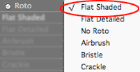
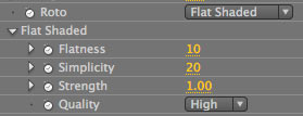
The Roto popup is set to Flat Shaded by default.
Let's change the Roto popup to Flat Detailed. Notice that the Flat Shaded group below grays out and the Flat Detailed group becomes active.
Flat Detailed is the other standard rotoscoping style. It renders its cartoon a little rougher than Flat Shaded, but it also preserves more detail and highlight information in the footage. You can see that the boys' shirts and faces have more dark/light contrast and the whole cartoon has more visual depth.

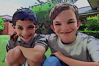
Left to right: Flat Shaded and Flat Detailed styles.
Step 3: Flatness setting
Let's go back to Flat Shaded and look at its settings. Choose Flat Shaded again from the Roto popup.
First there is Flatness. Flatness spreads out the color fields, making highlights and shadows stand out while reducing the cartoon's image depth. The higher Flatness is, the more flat the footage appears. It's set to 10 initially. If we lower Flatness to 2, the color fields have slightly more gradation between them. If we increase Flatness to 20, this rounds out the highlights in the footage and gives you a pretty good imatation of the rotoscope style used in the movie, Waking Life. Let's keep this setting.


Left to right: Flatness of 2 and 20. We're going to use Flatness at 20.
Step 4: Turn off Outlines (temporarily)
The Flatness change may be a little difficult to see because of the black outlines in our cartoon. Let's twirl down the Comic Outlines section and deselect the Comic checkmark. The black outlines will disappear and you can now see exactly what is happening with the colors. We'll turn the outlines back on in a few steps.
Step 5: Simplicity setting
Now let's go back to the Flat Shaded group and finish changing its settings.
Simplicity sets the number of color regions in the cartoon. The default of 20 often gives just the right amount of color detail. If we lower Simplicity to 5, our image gets a little posterized because the plug-in sets up too many color regions. If we raise Simplicity to 25, the colors get a bit mushy because there is less detail. We want the cartoon to stay smooth but have just a little more color detail, so let’s set Simplicity to 15.


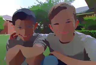
Left to right: Simplicity at 5, 15 and 25. We're going to use Simplicity at 15.
Step 6: Strength setting
Let's talk about Strength. Strength sets the visual strength of the cartoon by defining the separation between the dark, midtone and highlight color fields. Strength is set to 1 by default. Let's change this to 3 and... yikes. This higher value creates too much contrast between the lights and darks, which has resulted in exaggerated highlights and shadows.
Let's lower Strength to 1.5. Now the darks and lights are more blended and the gradations appear smoother but there's still more contrast added.

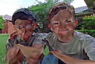
Left to right: Strength at 1.5 and 3. We're going to use Strength at 1.5.
Step 7: Comic Outlines
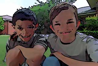
We have a pretty fine-looking cartoon already. Let's look how to add black lines around these color fields so our image looks more traditional. Go back to the Comic Outlines section and turn on the Comic checkbox.
Comic Outlines runs an edge detection that creates a thick smattering of hard, dark outlines. The effect looks like a traditionally inked graphic novel.

Adding Comic Outlines punches up the cartoon.
Step 8: Sensitivity setting
We can change how the Comic Outlines look with a few simple adjustments.
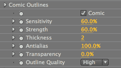
Sensitivity sets the number of lines, which affects the level of detail in the edges. If we lower it to 30, the lines are barely there. If we raise it to 90, the lines pile up to form dark areas that are too saturated. Let's change Sensitivity to 70 for a reasonable number of lines.


Left to right: Sensitivity at 30, 70 and 90. We're going to use Sensitivity at 70.
Step 9: Strength setting
Strength affects how heavily the lines are drawn. If we raise the value to 90, the lines get a little too heavy and clumped together. If we lower it to to 40, the lines are too thinned out and barely there. Let’s set Strength to 70 so the lines are a little heavier but not clumpy.

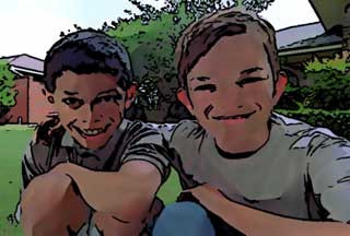
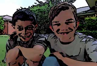
Left to right: Strength at 40, 70 and 90. We're going to use Strength at 90.
Step 10: Thickness setting
Thickness also affects the heaviness and width of the line stroke. If Thickness is lowered to 1, the lines are thin and quite subtle. At a value of 4, it creates a thick stroke that is almost stylized. Let’s set Thickness back to its default of 2 for outlines with some oomph but also a few subtleties. You can see that all of the Comic settings work together to give you a lot of control.


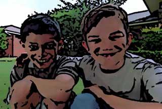
Left to right: Thickness at 1, 2 and 4. We're going to use Thickness at 2.
Step 11: Soft Outlines
There's another edge detection option called Soft Outlines. Let's uncheck Comic and twirl down the Soft Outlines group.
Turn on the Soft checkmark and you'll see that this generates soft lines with mild shading. As the name describes, Soft Outlines gives the footage outlines a slightly softer look, like they’re a little bit more blurred out. It also has easy settings that let you decide how thick or thin, heavy or light you want the lines to be.

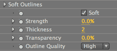
Adding Soft Outlines makes the cartoon look softer.
You're finished!
This cartoon looks great, very much like a cel-animated cartoon. You can surely see that we have only addressed a small part of what the Roto Toon plug-in can do. Red Giant ToonIt will help you to move any image from ordinary to spectacular with just a few clicks. Enjoy!